02
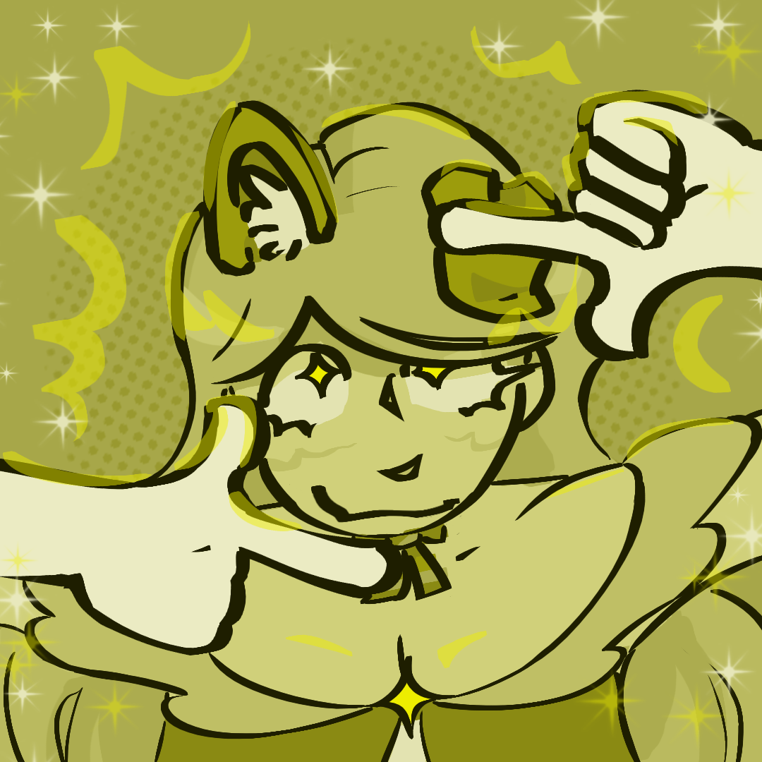
Okay, this is definitely one where I was still trying to find my footing colors-wise. I was trying to make most of the piece desaturated to give just little parts of it a nice pop, but it just makes the entire thing look muddy and gross. Not really the vibe I was hoping for, but live and learn. Most of this month's pieces are very saturated, and today is the reason why.
That said, I'm still quite proud of the linework. I was trying to use thickness to convey depth, and I don't think I did the worst job in the world. It's definitely conveying something. I was also going for a weird angle to flex my anatomy muscles, and I did okay! I don't hate it! A lot of these early November works feature looking at the head from an above angle because it's what I was trying to improve on at the time, and the result doesn't look awful, but I think I could have definitely stretched and exaggerated it a bit more. It doesn't look that different from directly head-on.
